You know the story about a boy and a girl who meet and fall in love? Replace the boy with the cover of ReSet and the girl with me—voilà! That’s this story.
I can’t wait any longer, so we’re going to start at the end, then we’ll backtrack to the beginning because…well, I insist.
BEHOLD!
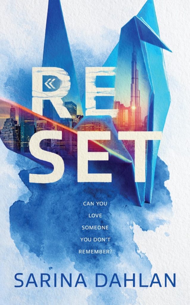
Isn’t it just glorious? I can’t tell you how much of this life I’ve spent staring at it. Hours. Days. Let’s just say it’s an embarrassingly long time.
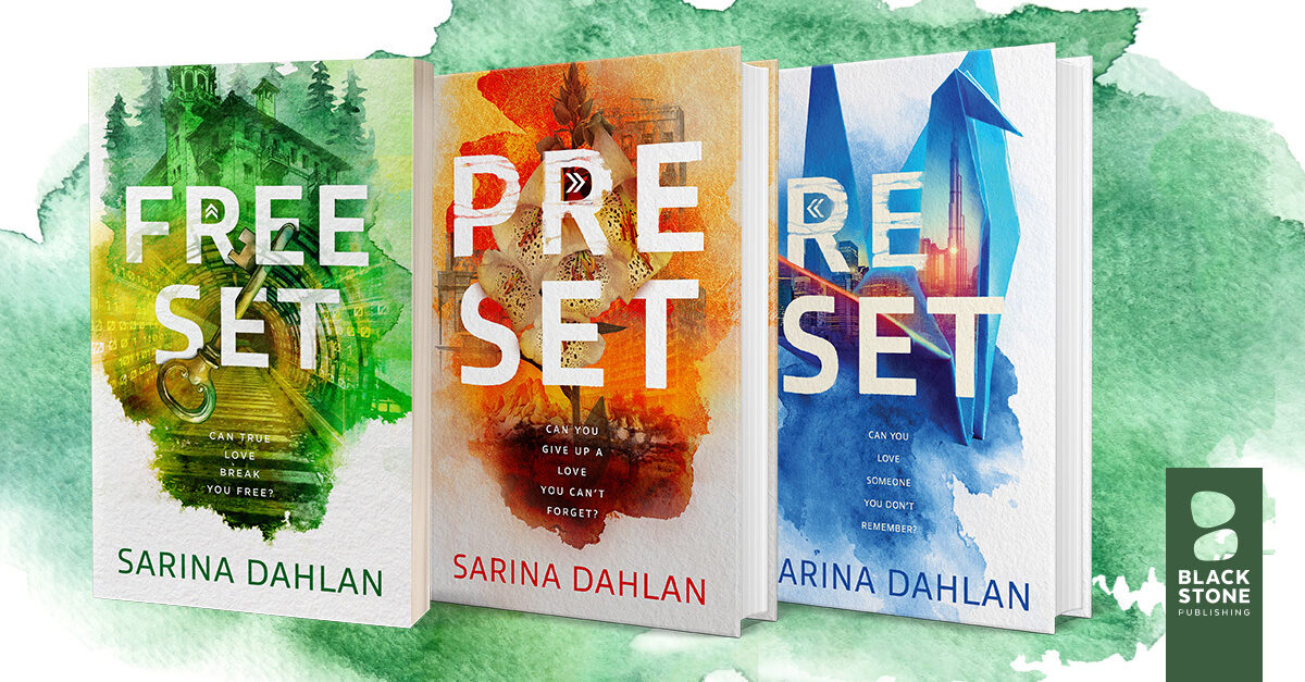
Our story begins on June 30, 2020. That day I received an email from my publisher, Blackstone Publishing, that indeed it was time to get started on the cover. The designer was to be Kurt Jones, who had created many beautiful covers such as this and this.
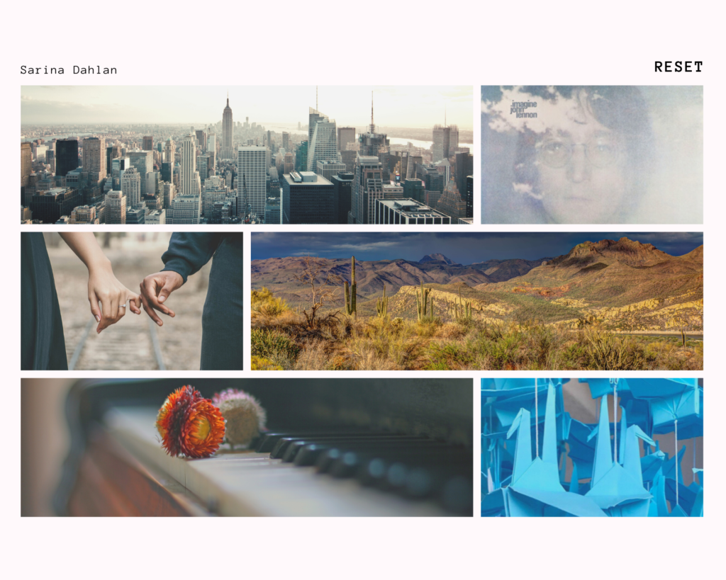
We began with an introductory call that also included Megan Wahrenbrock, the publishing director, and my wonderful agent, Julie Gwinn. We talked about the book, my thoughts on the cover (which involved the mood board I had sent prior), and a few inspirations.
Kurt asked some very thoughtful questions (one was which scenes I’d consider to be the cornerstones of the book.) We discussed the importance of the origami crane, both as a symbol of happiness and as a communication device in the world of ReSet. I was so excited, I reverted to my Valley Girl accent.
For those of you who don’t know, here’s the premise of ReSet.
Memories are considered a threat to peace in the utopia of the Four Cities. Its citizens undergo Tabula Rasa every four years to erase their minds of the past. No memories. No attachments. No wars. But memories have a way of seeping back through dreams.
Tabula Rasa—a blank slate. Crane—an ink blot of happiness. Paper and its rarity in the book’s world. The bleeding, blurry quality of dreams and memories. Kurt’s challenge was to take all of these nebulous thoughts and create a cover that sells. It was no small task.
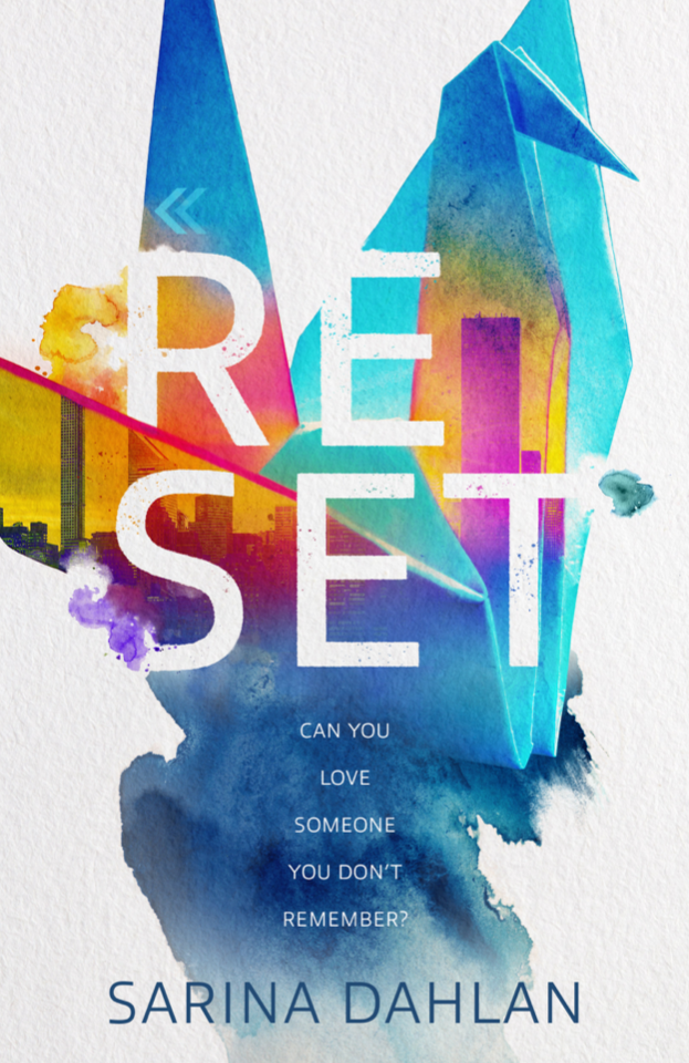
A few days later he sent me four mock-ups. They were all beautiful, but the first one was just—omg—how did he know?
I fell in love.
From there, we discussed the types of buildings in the Four Cities (slightly futuristic but not too sci-fi), color tones (more muted to reflect the moodiness of the weather), and the readability of the title (which led to adding more color behind the title.) At times, I miscommunicated my descriptions of colors (saturation and warmth are subjective values), but ultimately we ended up with something I’m so very proud of.
Kurt and the design team had allowed me into the process. I learned that everything on a cover has a purpose—the colors, the composition, the font—to draw the eyes to the title, to give a glimpse to the story inside, to incite curiosity. More importantly, the team included me in the decision making.
Because of my marketing background, I used a focus group to gather reactions, both instinctual and logical. I’m lucky that those in my circle are as diverse in talent and background as they come. I have architects and artists, but also a coding developer and a nurse. Some are readers, some not. I also asked my agent and her colleagues, as well as my developmental editor, Peggy Hageman who knew my book inside and out. I gathered some very valuable data, which I won’t go into. But ultimately, I used my gut.
A publishing house makes all the difference in a book’s journey. I’m so happy that, with my agent’s help, ReSet has found a home at Blackstone Publishing. The journey has been nothing but wonderful.
Advanced Reading Copy: November 25, 2020
Would you like a chance to win a FREE Advanced Reading Copy? Click here.
Release date: May 25, 2021
Subscribe to my newsletter to get book news, blogs, and upcoming giveaways.